
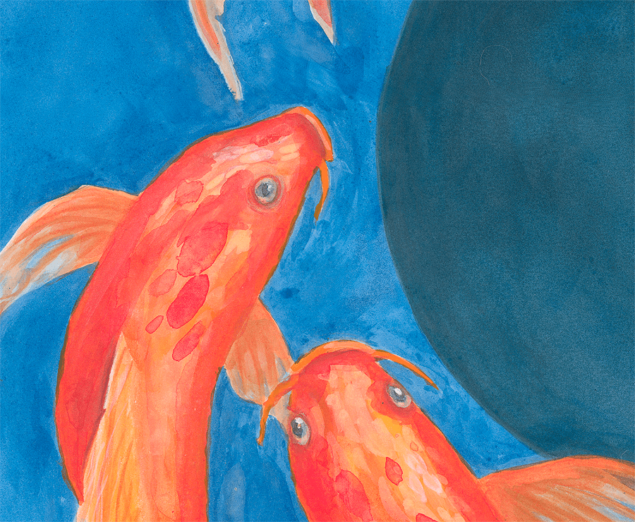
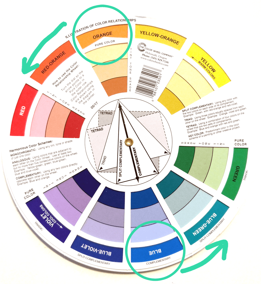
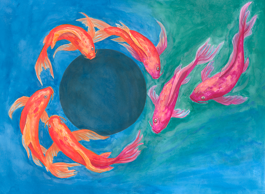
So here it is, my little fishy fishy painting! Main focus and inspiration for the piece was colors, complementary colors and color vibration. However, in the end the colors shifted quite a bit around the complementaries (orange, blue).
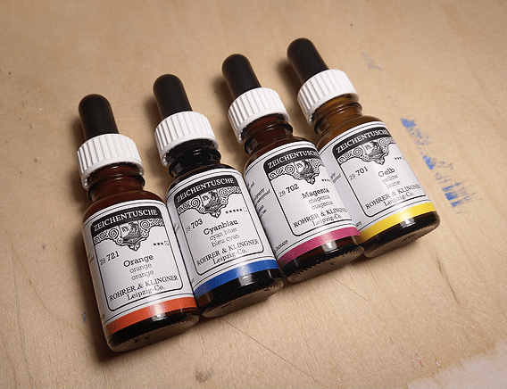
I made the painting using mainly Rohrer & Klingner calligraphy inks (https://www.rohrer-klingner.de/?page_id=1035&lang=en) and later I added some details using watercolors (the White Night pans and pearl colors of Kuretake Gansai Tambi).
I made the background and fish base colors in ink so the colors will not blend once dry. So inks were a bit safer to keep the fish and background edges from merging to grey, even if I end up fiddling too much. It was a bit of a battle to cover and blend large areas fast, while yet carefully working tiny details near the fish to avoid overlapping. Perhaps ink, or watercolor, as medium was not the best option for this size and planned theme. Instead with gouache or acrylics (or oil) would be simpler since the edges could be cleaned afterwards and color hue reworked on top of old layers. But I like challenges 😀
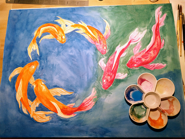
By using the liquid ink bottles, instead on water color pans, I could measure the exact amount of ink and water for any new mixes I needed for the washes. Thus the differences in hue comes mainly from my blending and if some areas started to dry already (thus causing sharp edges and layering, not blending anymore). But anyway, I do like the liveliness of the background.
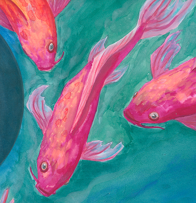
This was a nice trial, but I was rather intimidated to do the remaining details in inks, since if the color value and especially hue is wrong or I mess up, it is there, no fixing (unless I take out my gouache and possibly by then ruin it in other ways). So I opted back to more familiar medium and added some details with water colors (White Nights pans) and Faber-Castell Albrecht Dürer watercolor pencils.
The inks were quite nice to use, but maybe I should try them on something smaller next time 😀 and actually practice some color mixes and blending. No pressure, fail, learn and move on.
FYI: Related to colors, one awesome finding I recently did was, that Josef
Albers’s Interaction of Color can be downloaded as an app (iPhone/iPad):
https://apps.apple.com/us/app/interaction-color-by-josef/id664296461?ls=1
We used that book in color study course, in addition to Johannes Itten’s The
Elements of Color (Värit taiteessa). I had not realized there is an app also. I am using less and less physical copies of books nowadays so I just had to get that app now also, I will be exploring that more later. See all color course books listed here: https://soila.art.blog/2019/06/10/color-studies-124-2552019/)

Leave a comment