

Alrighty! Some results of my perhaps-to-be-continued-home-experiments with water based woodblock printing.
Carving:
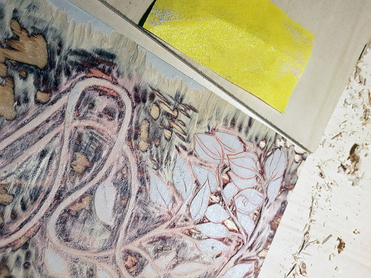
I made two two sided blocks for the printing. One for the background with some carving (part of the flowers and leaves to be left out of printing), own for flowers, leaves and last the vines/branches.
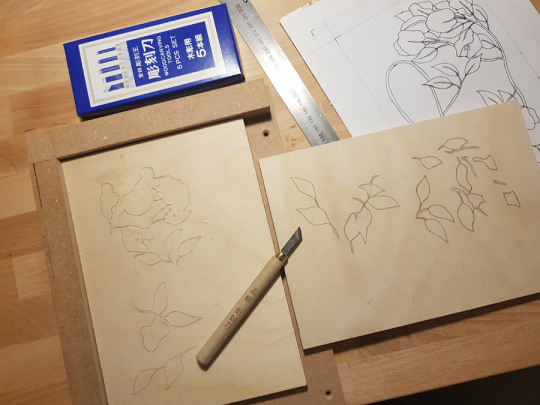
I have to say that it would be nice to try carving a ‘proper’ wood block, instead of dry splintery plywood. It is definitely not for tiny details, especially if a fast not-so-accurate-noob, like me, is doing the carving. Of course quality and sharp tools make a huge difference for any wood carving, my cheap tools being just decent I suppose. If I do plan to do more carving, I will definitely invest in a good quality hangi-toh. But first I should perhaps be a bit more patient in carving as well.
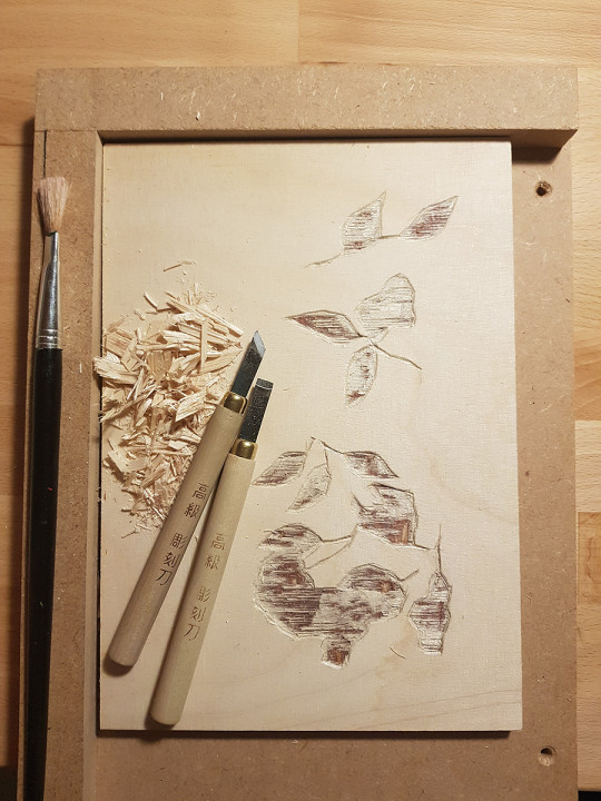
Now I used for the carving only a hangi-toh cutting knife and an ai-suki chisel. I had in the noob-set just once size of the chisel, but the areas to clear were not too huge so I managed, barely. I do not have a mallet but there would have been a small maru-nomi, u-gauge, to use, but instead I tortured myself with the wider area cleaning using ai-suki. Not sure If I would have managed with u-gauge as the wood was chipping a lot, so likely I would have destroyed a lot of to be printed areas.
For printing I did the kento markings to my carving bench hook instead of the blocks. I used quite small blocks and the entire surface as print area and wanted to leave some unprinted space to the paper. For carving I actually used a non-slip fabric under the block.
Printing:
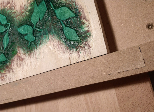
I used basic water color tubes for the printing with Japanese nori paste. The colors I used were (White Nights): emerald green, carmine, cadmium yellow medium and cerulean blue.
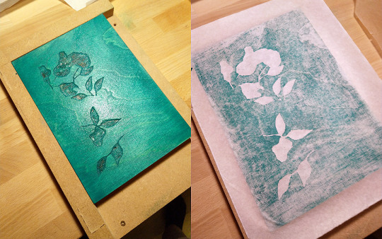
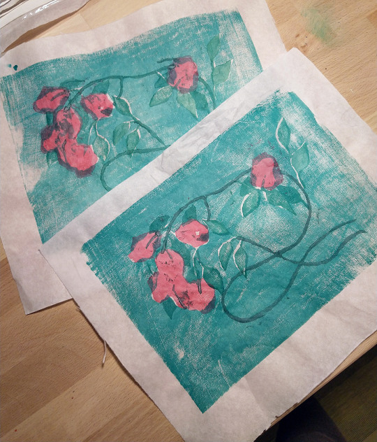
For the last experiments I changed the background color darker, since the layering was not as strong with the cerulean blue. Intentions was to make some leaves and some petals of the flowers
more darker
with the layering. But I think the lighter color was nicer after all.
For leaves I used in first prints also a bit yellow but ditched that for later prints. The branches/vines I made either green or added also red to make them darker.
First printing session:
First test runs on some basic drawing paper (moistened for ~12h):
Needs adjustments to blocks, making a bit mess from unwanted areas (carve deeper)
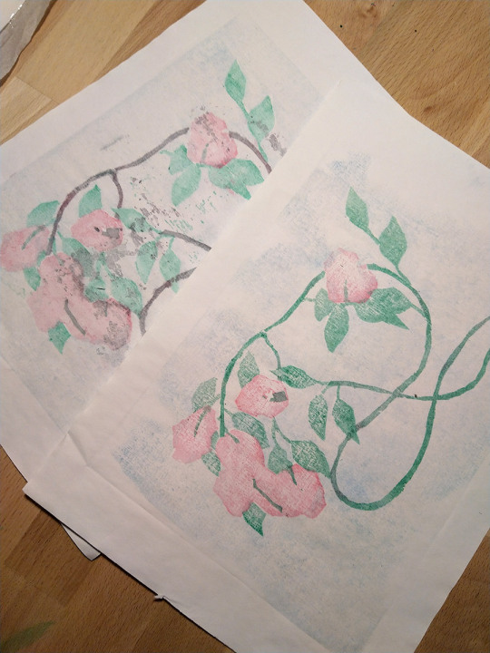
Second experiments on Japanese, quite transparent, paper (moistened for ~12h):
The paper was maybe a bit too wet, it sank quite deep to the block when printing, thus taking more color in wrong places than the more firm drawing paper test print did. Did more adjustments to the vines/branches block (carve deeper).
Third experiments on a left over ready cut hahnemuhle water color paper (moistened for ~1hour)
Otherwise this would have been quite ok, better spread to background block and more cleaning to blocks needed, the leaves leave unwanted marks (I did not bother to do the carving then, so I forgot this for the next test run).
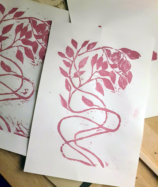
So these next tests I did quite a while later from the first set and now with darker background color:
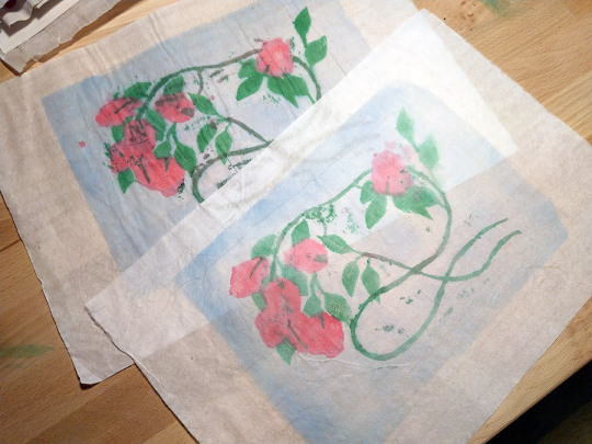
Fourth experiment on Japanese paper (dry) (lower paper):
The paper was a bit different than the previous Japanese paper, the other side was clearly more smooth and slightly glossy, not as transparent. In both I misplaced the blocks, not properly aligned with the frame (noticed after printing).
In above image there is also seen the fifth experiment (on top) on Japanese paper (dry). Now I did more cleaning on one block with the leaves and I moistened block the just once and waited a bit before printing. I was also more careful not to splash the block with too much color. Although background I should have diluted with water a bit more and yet again spread better. I suppose I had my best effort on the last one (some lessons learned) 😀 With the dry paper, the wood surface patterns seem more visible, as well as the uneven spread.
I also did a simple one block and one color version print earlier (before this multi block mess), so just few pics of that trial:
I had to sand the block since it was originally prepared for oil based printing so water colour would not stick. Printed on the basic drawing paper (dry). Here in colors I used also white with red, which is not traditional for mokuhanga. And actually I used gouache instead of water color, so more opaque anyway.
Overall nice experiments but now I am eager to clean my desk for some water color painting for a change.
Some notices, that it is important to have the the block prepared well, not just carving clean and deep enough but also moisturing the block before printing. Also the paper moistening is quite important for the printing, of course depending on the used paper.
I guess I did all the possible failures with too much/less color, too dry/wet paper and or block.. but ofc I was, maybe a bit too eager to try also different papers, rather than mastering one properly 😀 (trial and error!) But good experience and learning towards a proper print, at some point.
I still need to clean some of the blocks a bit and in future prints I need to be careful with the amount of color (not too thick, spread evenly) and not to wet the block too much with water or add too much color. Also need to consider per the used paper how to moisten it ‘just enough’.

Leave a comment