
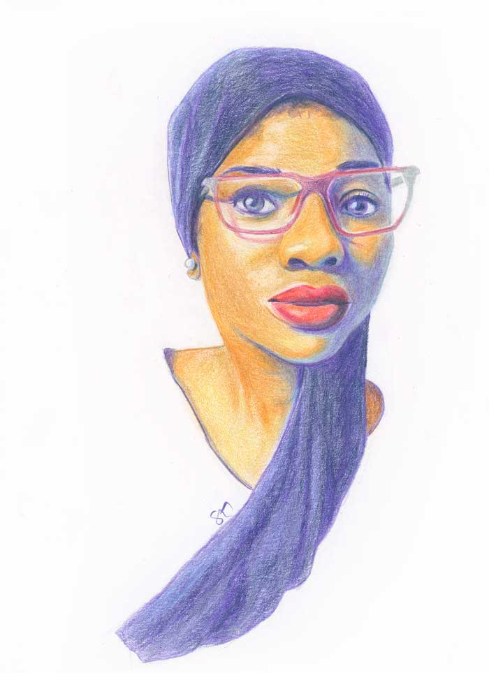
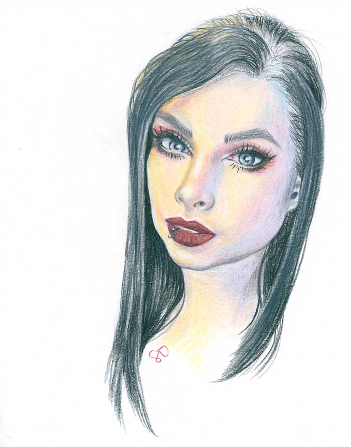
This time I did few practices using just colored pencils.
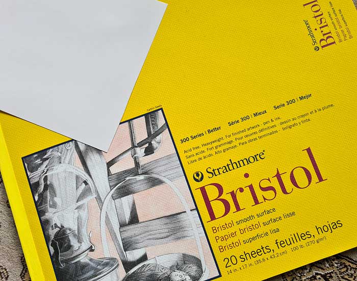
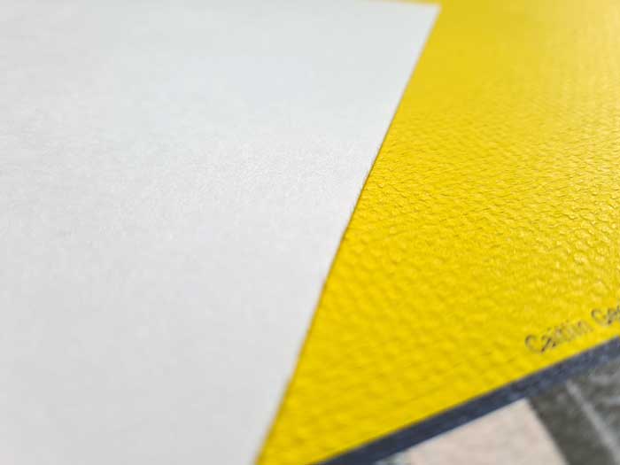
I used for the first time Strathmore Bristol smooth surface paper (270GSM). It was quite nice, very smooth and strong. I cut the sheet into four pieces, but I have just two of those drawn at this point 😛 (posted in the end). I wanted to trial a higher end paper instead of some basic sketching paper and in smaller scale than the sheets I have.
The first portrait drawing I did using Faber-Castell Polychromos colored pencils and the latter with Caran d’Ache Luminance pencils.
- Polychromos pencils are oil-based
- Luminance pencils are wax-based
Both are artist grade and as such have high light-fastness and quality.
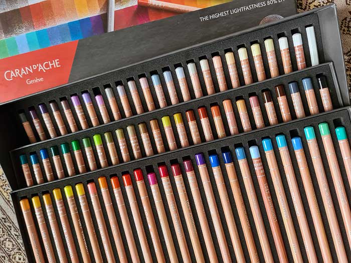


I am not sure which brand colored pencils I prefer most, I have not really used them in many pieces alone. The Polychromos set range of colors is higher (120) and the Luminance set has smaller range of colors (76) and quite a lot of those are light colors and less saturated hues. I need to experiment more with colored pencils, no matter the brand, and learn layering colors to produce the colors I want and to get more smooth finish. Maybe then I will have stronger opinion, or which is better in what purposes, lets see 🙂 Right now I choose depending on what I am drawing, the colors I need.
So, now per the color options in each set I chose to do the more vibrant piece in Polychromos pencils and the lighter with Luminance.
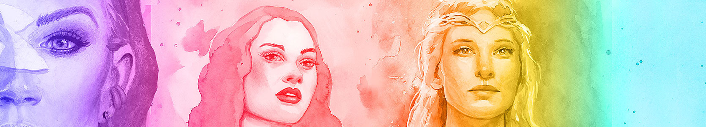
Finished portraits:
I could’ve still continued with the layering, to loose more the graininess, or just use solvents, but I did not want these to be massive time consuming works but more of quick small practices.
I did not use any solvents in these, but I did use the Luminance set blender in both to smooth the colors at least somewhat.
I checked inspiration again via sktchy for these studies. I liked the colors in both references, in the first due to the colored shadows and the the other due to the colored lights and I got to make more vibrant vs. less saturated pieces.

Leave a comment