A few watercolor portrait studies for a change. I checked again inspiration via sktchy app for watercolor studies with one color under paintings.
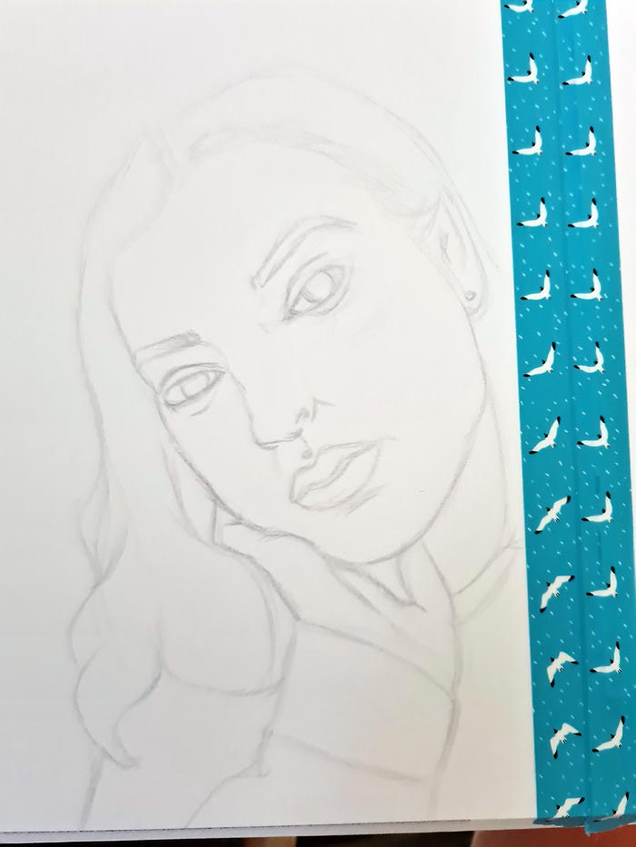
I did observation drawings with colored pencil straight to the watercolor paper, so no tracing, grids or otherwise heavy measuring involved, just a rough sketch based on an image. Colored pencil has to be used quite lightly as it is not that erasable, so I did not work on the sketch too long. You could also sketch using graphite pencils, so that is then more erasable. Sometimes I also sketch using watercolor pencils, so lines are then blended when painting. (but not that erasable either)
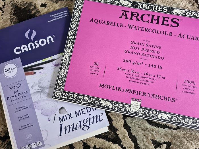
The first studies I did with my not so expensive paper that I use for studies (Canson Mix media Imagine, 200GSM) and the second studies I did on my new Arches watercolor paper (Arches aquarelle hot pressed, 300GSM). This was my first time using the paper.
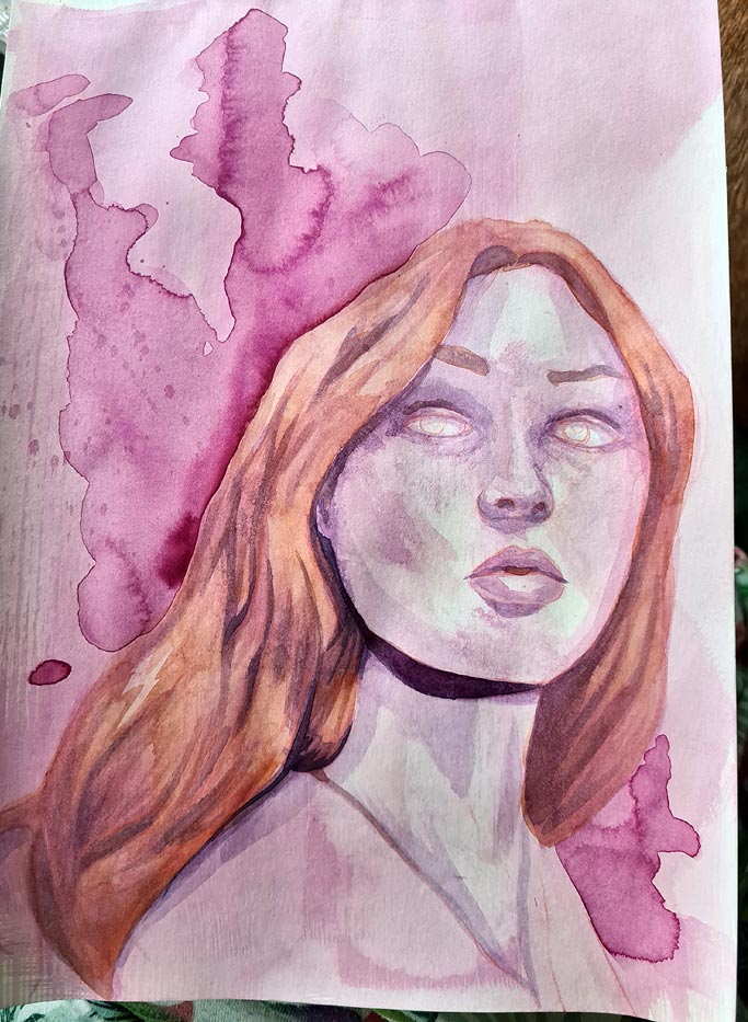
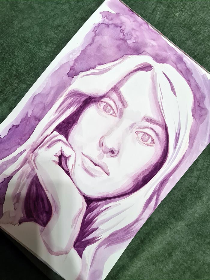
In the first paintings I wanted to use colors that I can quite easily blend with the skin tones, so I chose to use pink and purple.
First duo (Canson):
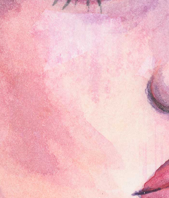
In the pink painting I accidentally started to paint all over the entire paper, thus the face got a bit splotchy as I tried to blend and lift excess out. Since the paper is not of that high quality, it does not really like lifting and scrubbing, so I left it alone after some attempts. Overall the skin turned a bit splotchy and darker than I intended.
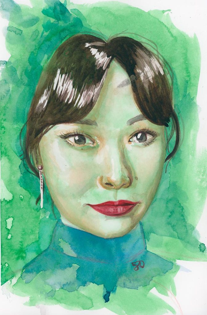
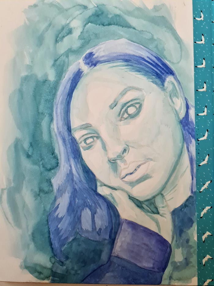
In the second duo I started with the blue/turquoise blue combo as a bit safer option still and then I did the latter of the two with quite bright yellowish green. Unfortunately I failed to take work in progress shots for the green one, but there I intentionally used quite heavy washes all over the paper and preserved some highlights with masking fluid.
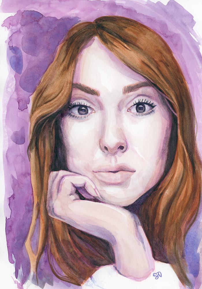
Second duo (Arches):
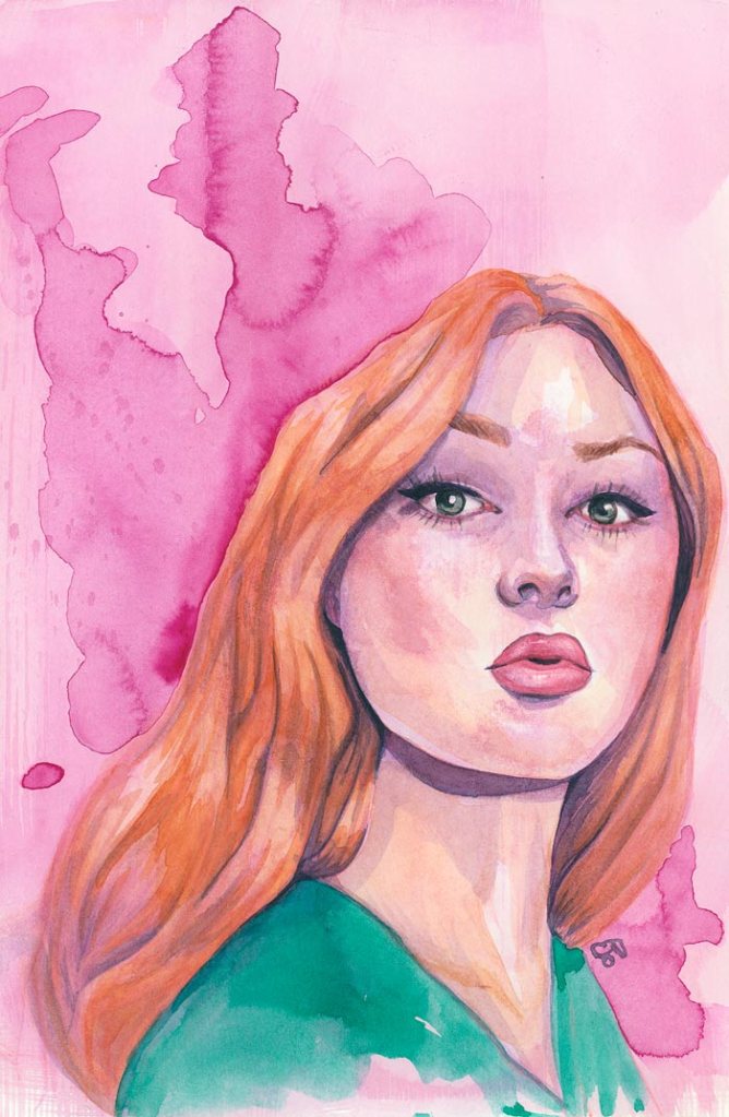
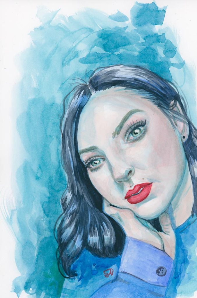
So, in the first painting I did, I used blue and turquoise blue as under painting colors and then pinkish skin tones on top, Payne’s grey in hair, blue shirt and red lips. In green one I used a bit more unusual green under painting and then more orange hues on skin, blue in shirt, sepia in hair and again red lips.
I used also masking fluid in these latter two to ensure I preserve highlights and dared to do more loose and stronger washes. In the green painting you can see a smudge in her forehead that I could not lift off.
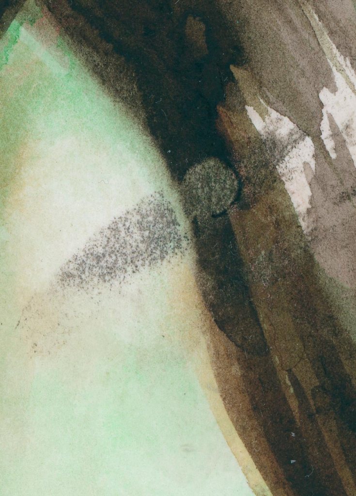
I guess there was heavy color concentration of watercolor on top and when I rubbed masking fluid off, I smudged the paint straight into her face. Otherwise this time the masking fluid did not rip the paper. I used it in very light layers and applied it with an old brush. Success!
The Arches aquarelle hot press paper seems very nice, smooth as expected. One notice was, that it absorbed the watercolor quite fast, so attempt on blending edges right after required a bit of scrubbing. So, had to remember to wet the paper first before color washes and you then can more easily blend the edges as needed.
I was planning on doing some colored pencil portrait drawings next, but I cannot find my only proper pencil sharpener… the other old pencil sharpener is too narrow. Oh well. I’ll probably then continue with watercolor, or gouache, until I find the sharpener (or have to buy a new one…).


Leave a comment