
I participated in a woodblock printing course for a change, a quick three day workshop just before going to a holiday trip 😀 no pressure. And it didn’t go well.
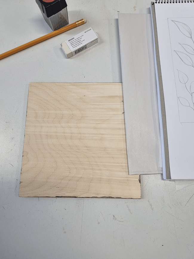
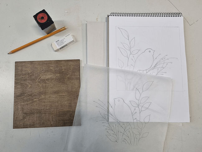
Day one was getting to know the tools and place again and then planning what to do. This day I basically just prepared a wood block and started doodling what to to.
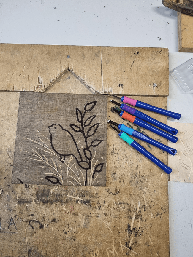
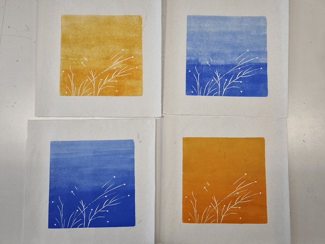
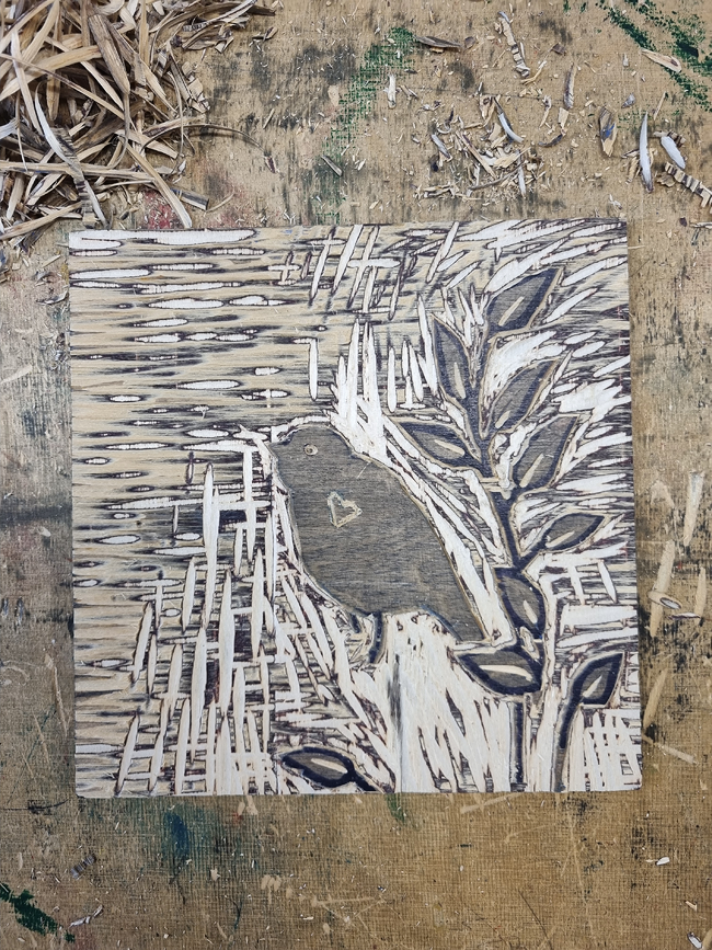
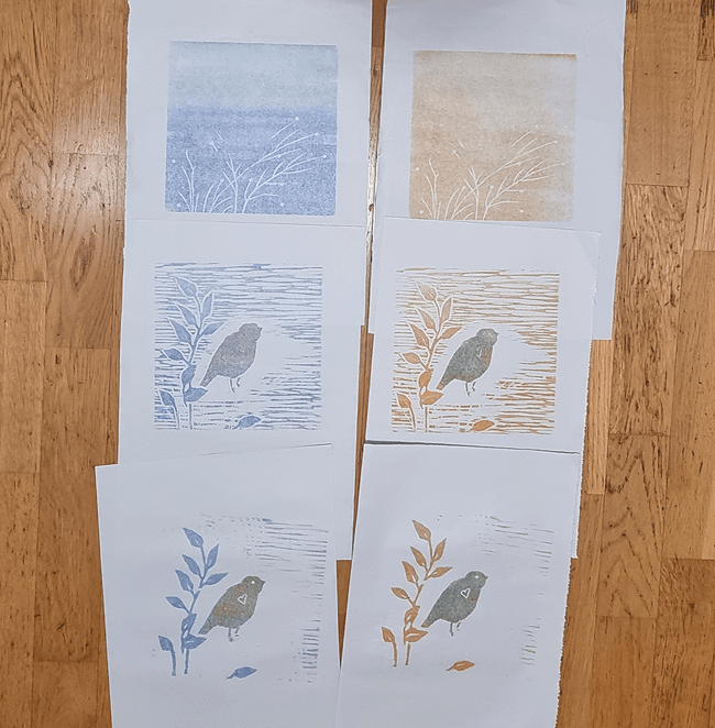
Day two I prepared four wood block printing papers (26,5cm x 26,5cm), transferred the drawing to the wood block and carved the first areas out for white details. Then I did the first layer of color to the papers. First blue gradient color layer printing the same colors twice for two papers in a row, thus the latter being a lighter version of the first. And the same for orange gradient for the remaining two papers. After the printing I started working on the block again, removing the background (sky) areas of wood so I could continue on color layer two the next day.
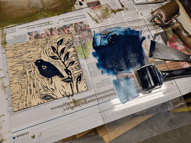
Day three I started with the next color layer, printed all four papers similarly as before, where the color layer is printed twice in a row to different papers. I also used a bit different colors in the bird vs. other areas, in one color layer. A darker area to background with similar color and switched blue bird to orange background and orange bird to blue background.

(apparently at this stage I only took picture of the tile but not prints.. 😛 basically it was the same as last layer prints, just lighter shade in the foliage and bird)
After the second printing I yet again continued to remove wood for the last color layer.
And ta-da, I managed to finish the work 😀 And it is terrible. I was trying to keep it simplified since I knew most of my time in the beginning would go trying to get an idea into paper and if I had too big block with complex design, the carving and color layer planning could take ages. As the piece was rather simple, I was not that worried of colors (should have), I just thought of that one layer at a time. At the time it would’ve been a bit too overwhelming for me, but on the other hand, the results were not that great then either 😀
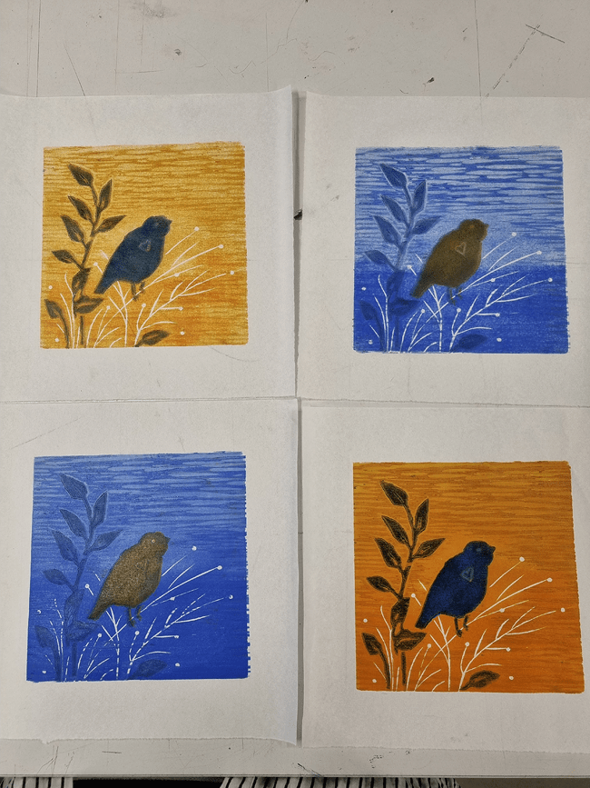
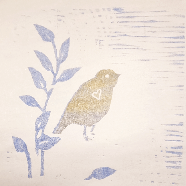
The problems were, I should have done more clean cuts in the second layer, use stronger color and take the bird out entirely for the last layer. Instead I did clean up on the third layer trying to fix the mess (leaves and bird), which caused some areas to shrink also, which caused the new layers to look off (blurry), even though I tried to compensate that with darker last layer. There might have been also a bit too much color in the layer (and then too little in later when I tried to fix that with orange prints). Also the earlier layers were not dry so I was adding yet again more wet colors to same areas. Also design-wise I should have carved more white areas, or left the whites to a less dominant role, or just started with a full color layer without any carvings (no whites).
Oh well, nice practice and lessons learned. BTW, the backing papers that took the excess colors through the thin printing paper got the best results ;D (see below)
The colors used were oil based paints.

Leave a comment